tryCricket
Acquiring new customers by delivering the best switcher experience.
 tryCricket App
Process Includes
- Strategy, Idea and Concept
- Analytics
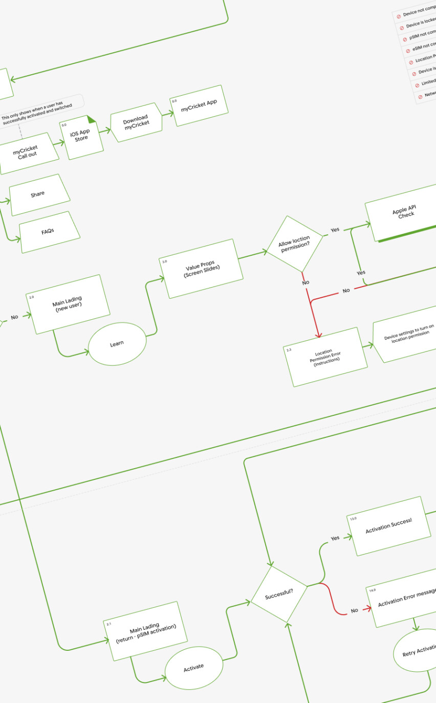
- User Flows
- UX & UI Design
- Prototyping
- User Testing
What are we solving for?
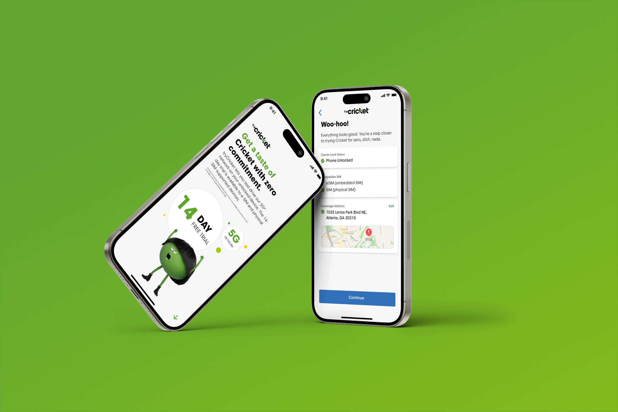
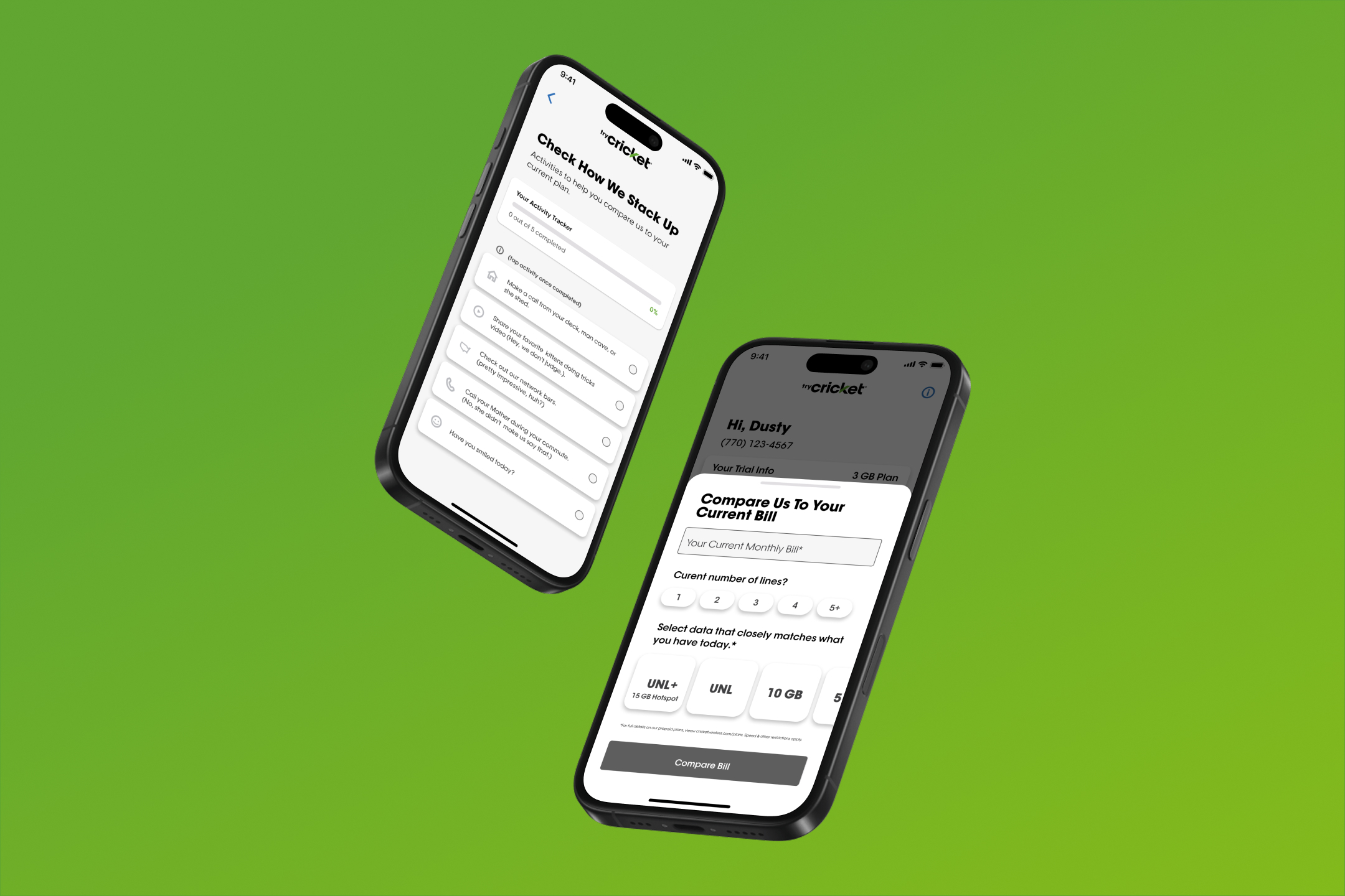
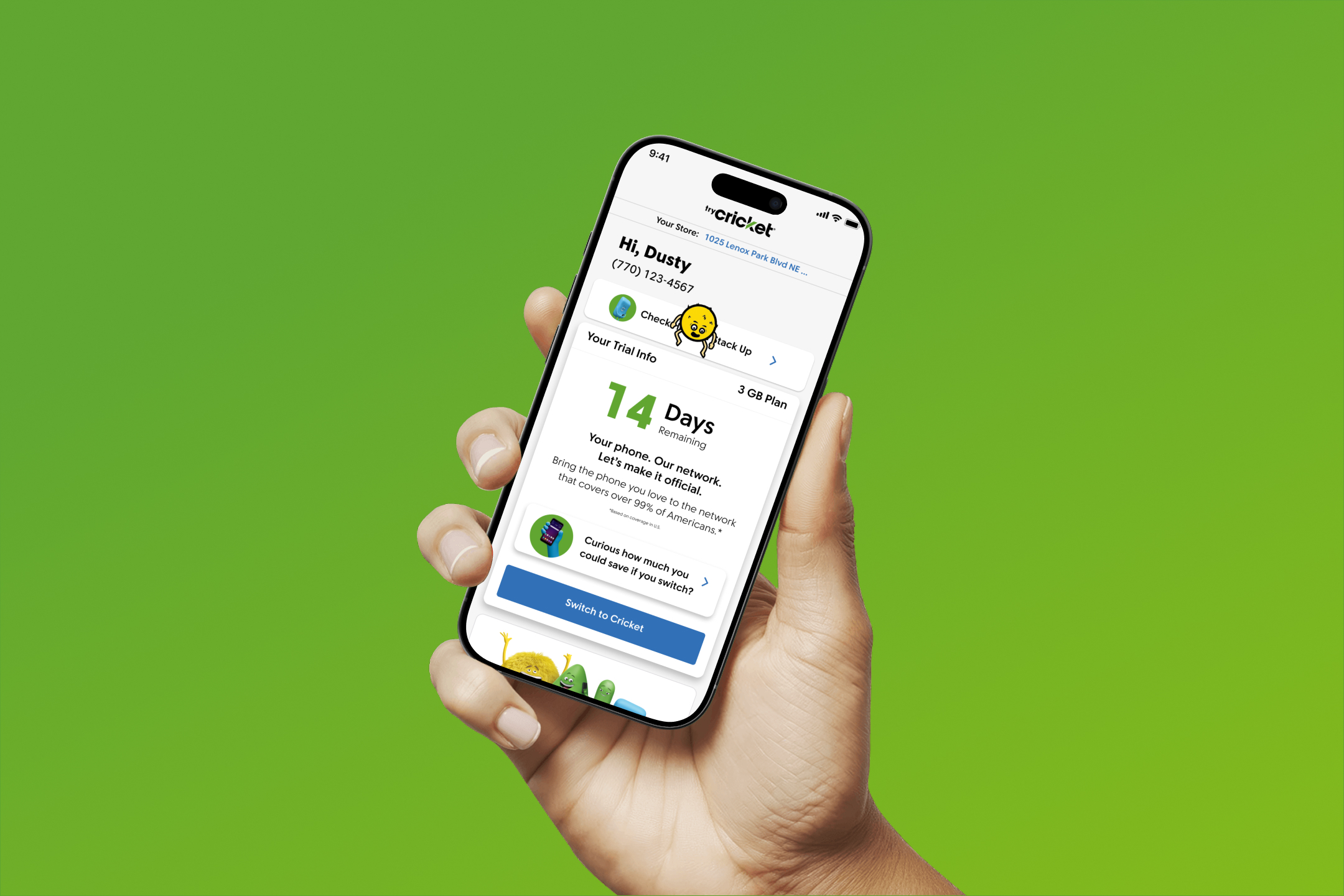
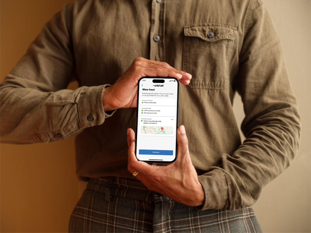
Cricket Wireless faced the challenge of converting prospective customers hesitant about network performance into loyal subscribers. To address this, we conceptualized and developed the tryCricket app—a unique, native eSIM installation app that allowed users to experience Cricket’s network firsthand via a free trial, lowering barriers to adoption.
The tryCricket scrum team was empowered with full autonomy and accountability, free from distractions and micromanagement. This focus accelerated progress, enabling rapid execution from concept to launch.
Competitive Analysis
Overview of Competitor Landscape and Existing Solutions
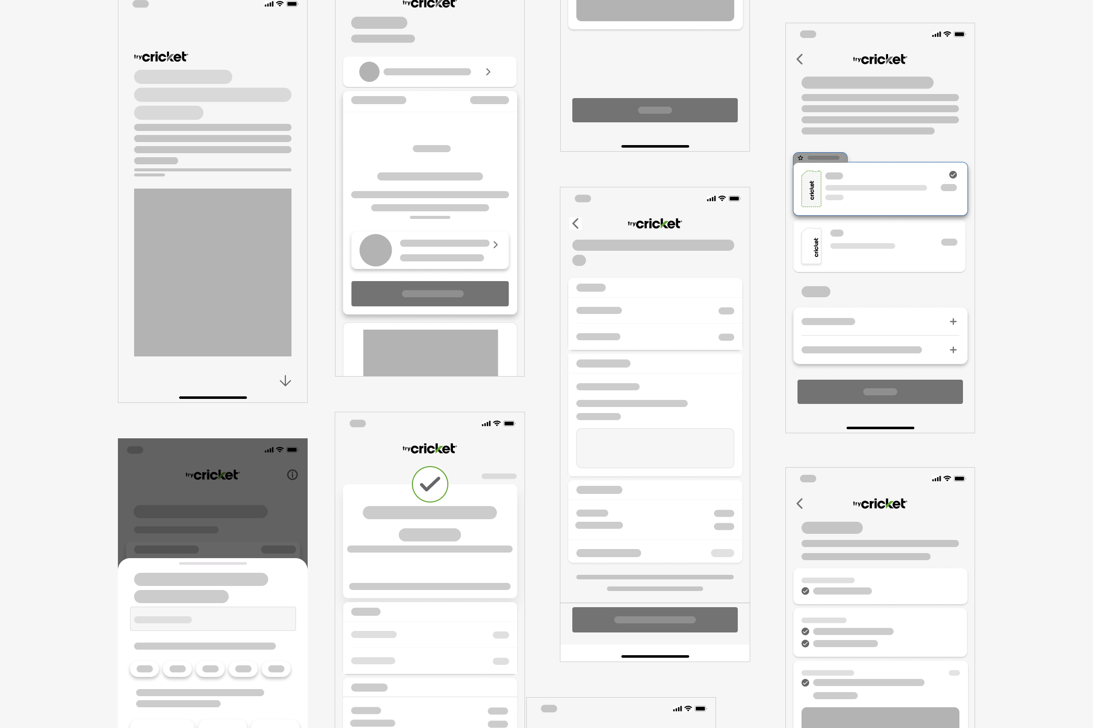
To gain a comprehensive understanding of the current market, including gaps and opportunities, we conducted an in-depth competitive analysis of both direct and indirect competitors in the telecommunications app space (Fig.1). This analysis involved evaluating existing digital products that offered similar functionalities such as trial subscriptions, mobile account management, and eSIM installations. We assessed their UX/UI design, feature sets, onboarding flows, and overall user satisfaction to benchmark industry standards.
Collaborative Focus Group Insights
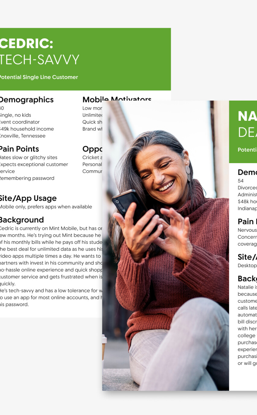
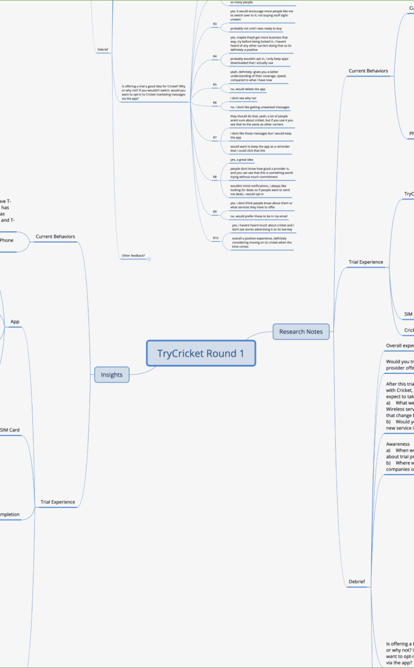
In partnership with our UX research team, we organized focus group sessions involving a diverse group of participants representing our target user base. These sessions aimed to gather qualitative insights about user expectations, frustrations, and unmet needs when interacting with competitor apps. The real-time feedback provided a rich understanding of pain points and preferences from a user perspective.
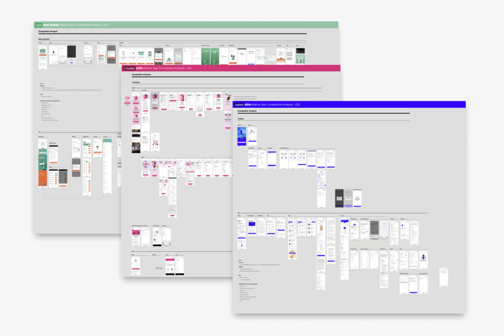
- Fig.1 Trial competitor analysis (mint mobile, t-mobile, visible)
Key Insights and Gaps Identified
The competitive analysis and focus group revealed several critical UX/UI gaps across existing solutions, including complex onboarding processes, limited guidance for eSIM activation, and suboptimal navigation that hindered seamless trial-to-paid conversions. Users expressed a desire for a more intuitive, streamlined experience that minimized technical jargon and reduced friction during key tasks.
Influence on Feature Prioritization and Design Decisions
Acknowledging that the first release would not be perfect, we prioritized rapid delivery to get the app into users’ hands quickly. This Minimum Viable Product (MVP) approach allowed us to gather authentic, real-world feedback early in the process. The insights from competitive analysis and user sessions directly shaped our feature prioritization — focusing on simplifying the trial sign-up, clarifying eSIM installation steps, and enhancing user flow intuitiveness. This iterative feedback loop enabled us to refine the app’s design continuously and plan future enhancements, ultimately creating a user experience that was more aligned with customer needs and industry-leading standards.
Density Pixel Grid
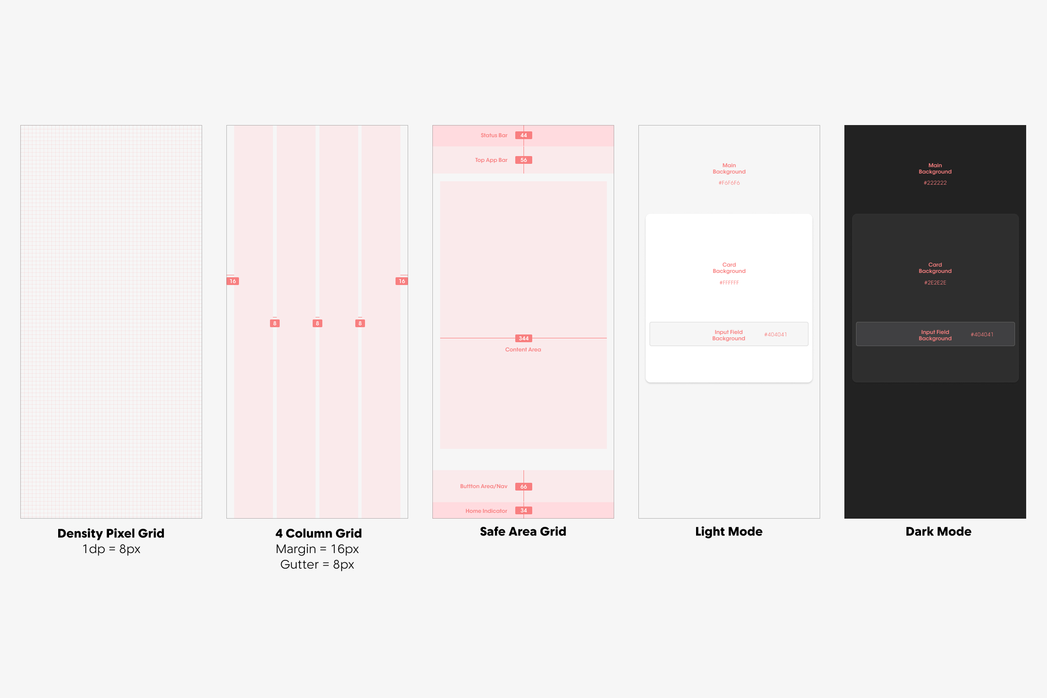
The base of the design system is the Density Pixel Grid, where 1dp equals 8px. This foundational structure creates a modular and scalable framework that ensures alignment and proportionality across all UI elements. By adopting a multiple-of-8 scaling system, designers ensure that all layout elements, including margins, paddings, and component sizes, are cohesive and visually balanced. This approach simplifies responsiveness and adaptability across devices with varying screen resolutions.
- Visual Details: The density grid is depicted as a fine, uniform grid of squares, each measuring 8px x 8px, serving as the underlying guide for all design elements.
Column Grid System
The design progresses to a 4-column grid system with a 16px margin on the left and right edges and an 8px gutter between columns. This grid structure provides flexibility for organizing content while maintaining a clean and structured layout.
Safe Area Grid
The Safe Area Grid introduces a critical layer of usability by accounting for device-specific constraints, such as status bars, navigation bars, and home indicators. This ensures that the app’s content remains accessible and visually balanced across all devices.
- Key Measurements:
- Status Bar: 44px height.
- Top App Bar: 56px height, providing space for navigation and branding.
- Button Area/Navigation: 66px height for actionable elements like buttons and navigation controls.
- Home Indicator: 34px height, ensuring compatibility with devices using gesture-based navigation.
User Interface
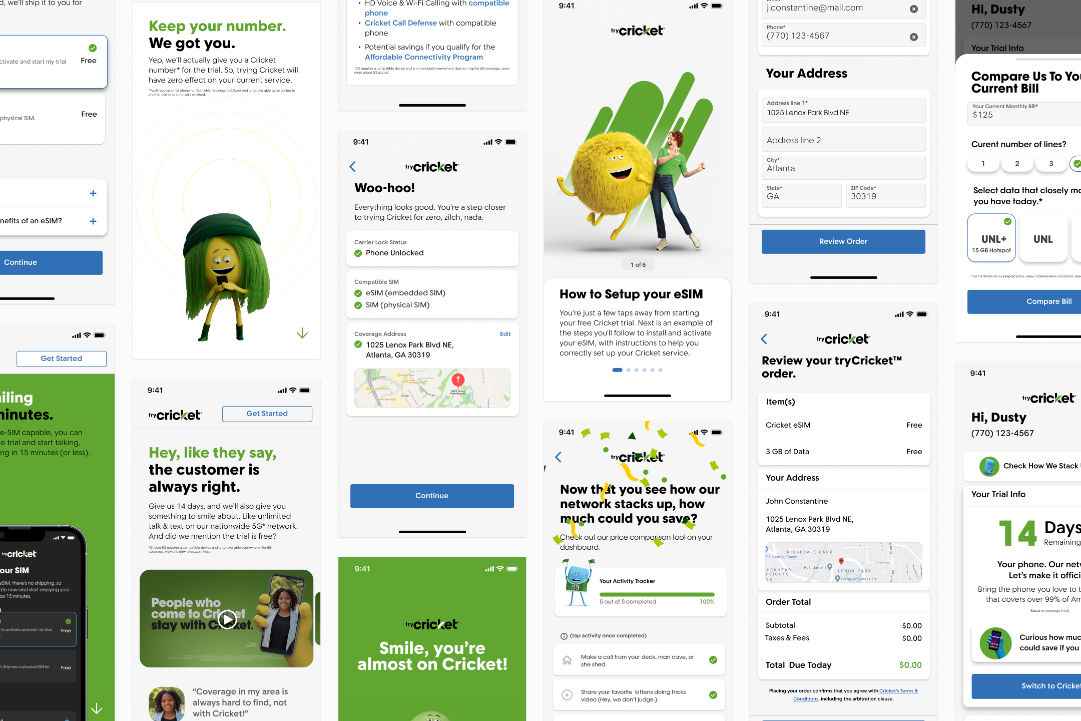
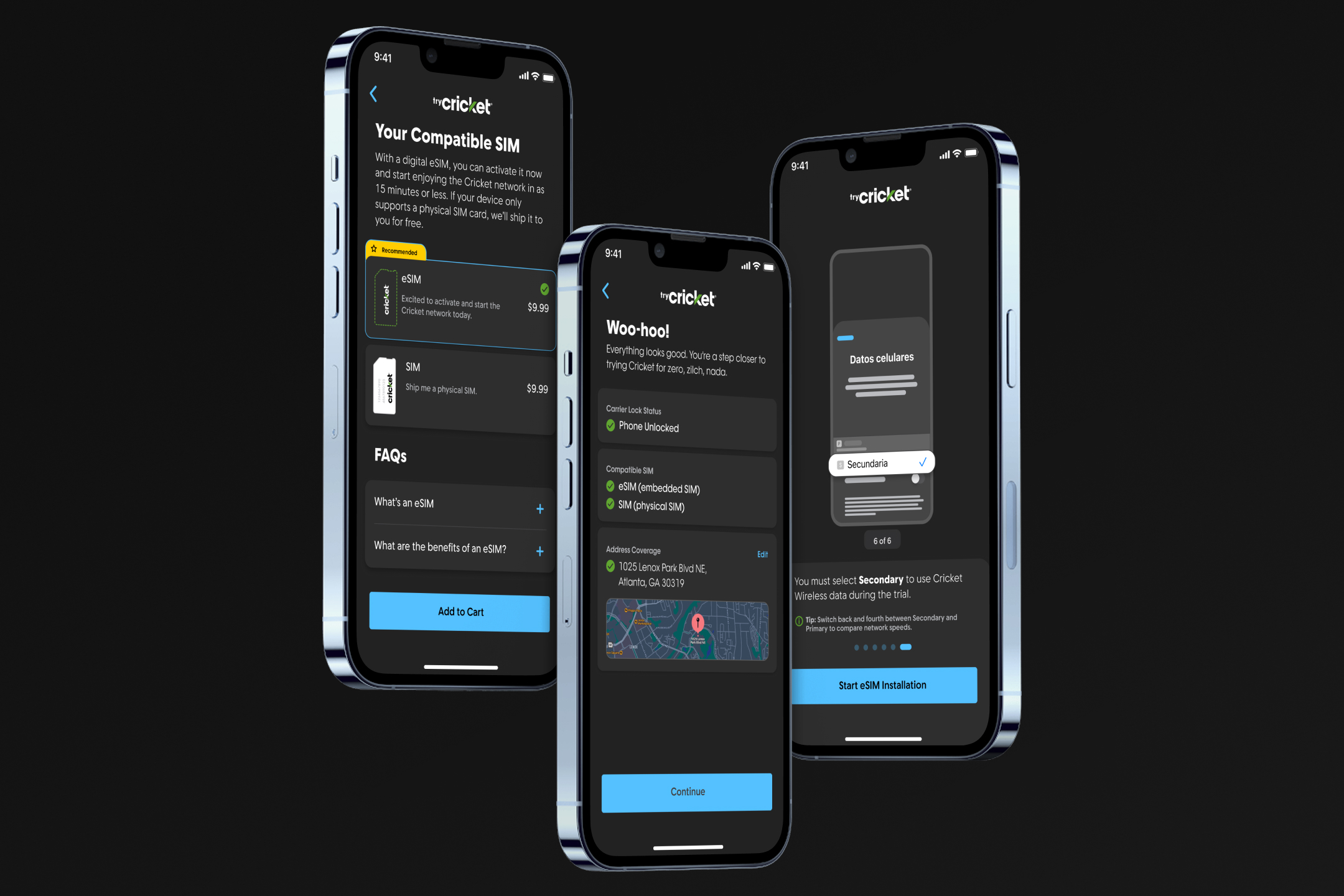
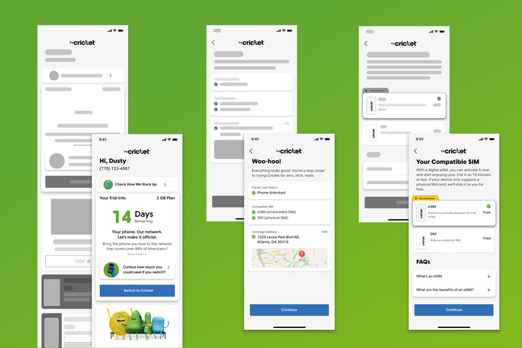
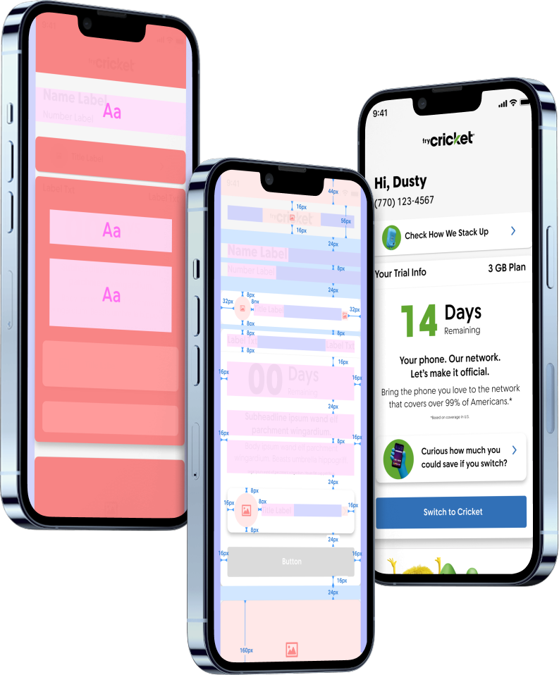
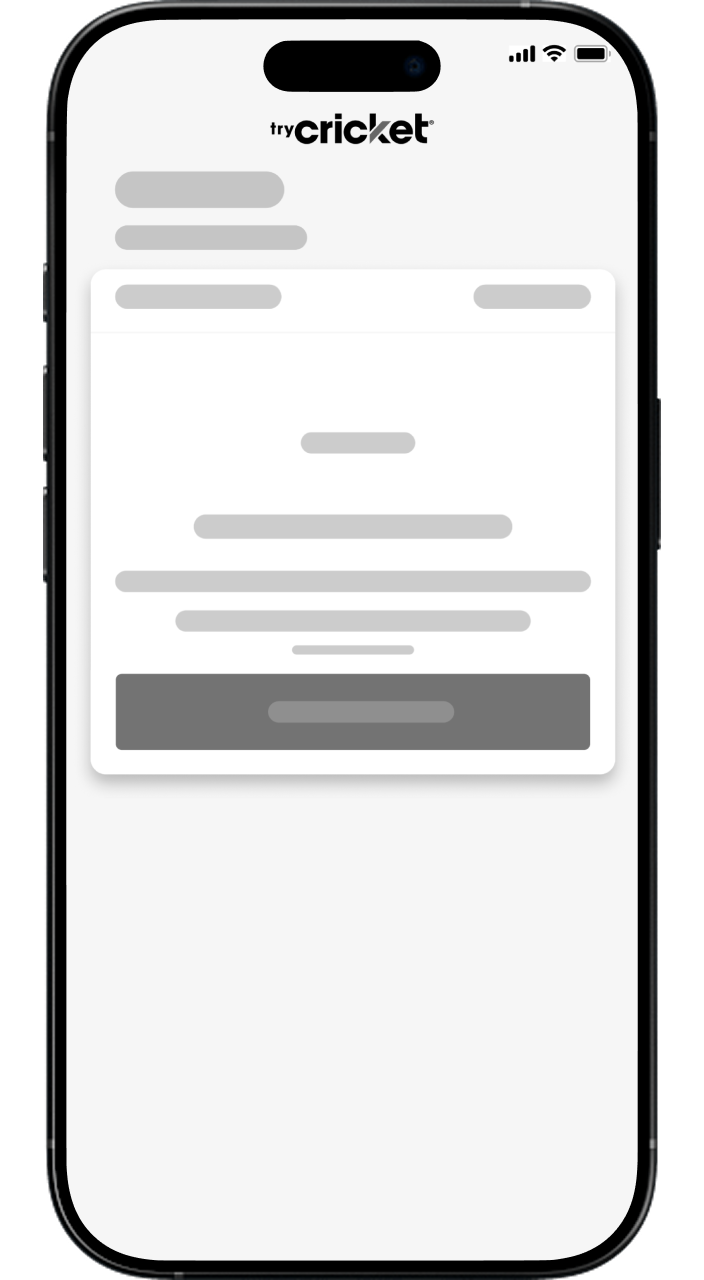
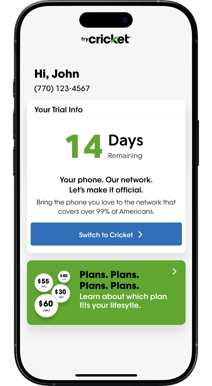
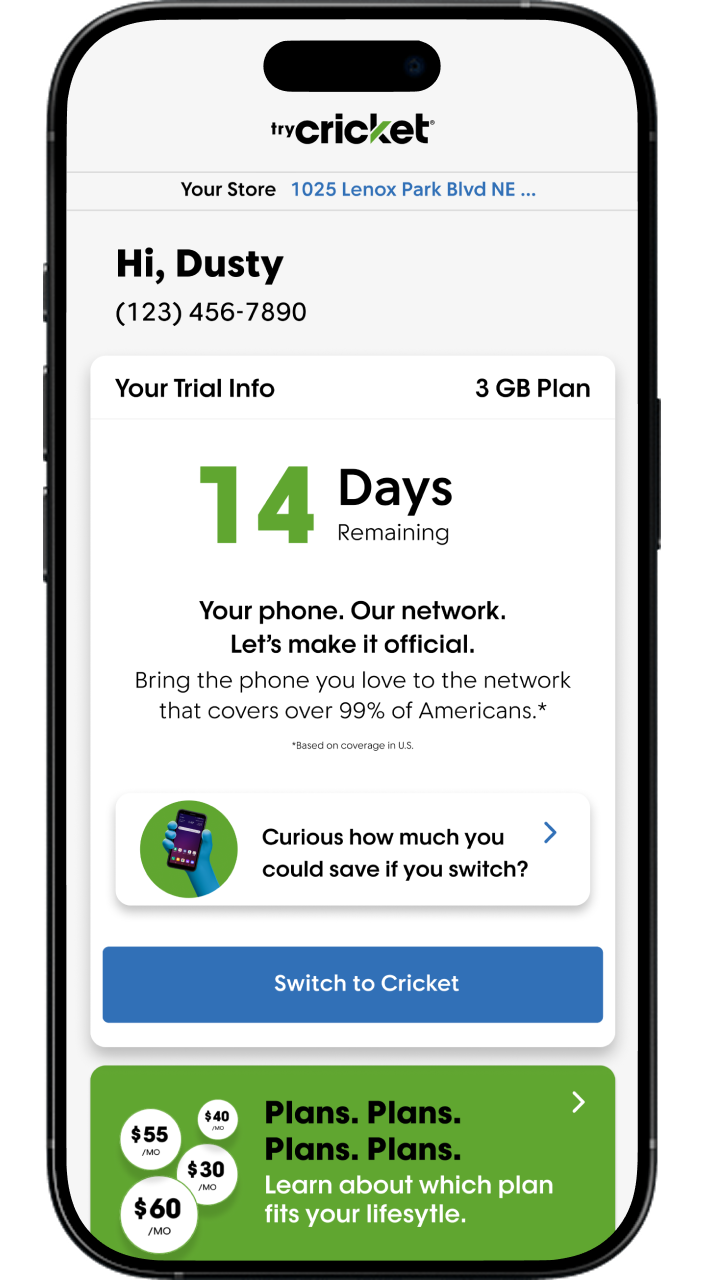
The tryCricket app was designed with the goal of simplifying the onboarding process for users to trial Cricket Wireless services, particularly focusing on eSIM adoption. The UI design prioritizes clean white space, modularity, and intuitive navigation to reduce cognitive load and empower non-technical users to complete the setup process seamlessly within 15 minutes without requiring external support. By leveraging user feedback, industry best practices, and UX laws, the app delivers a frictionless experience while educating users along the way.
Visual Hierarchy:
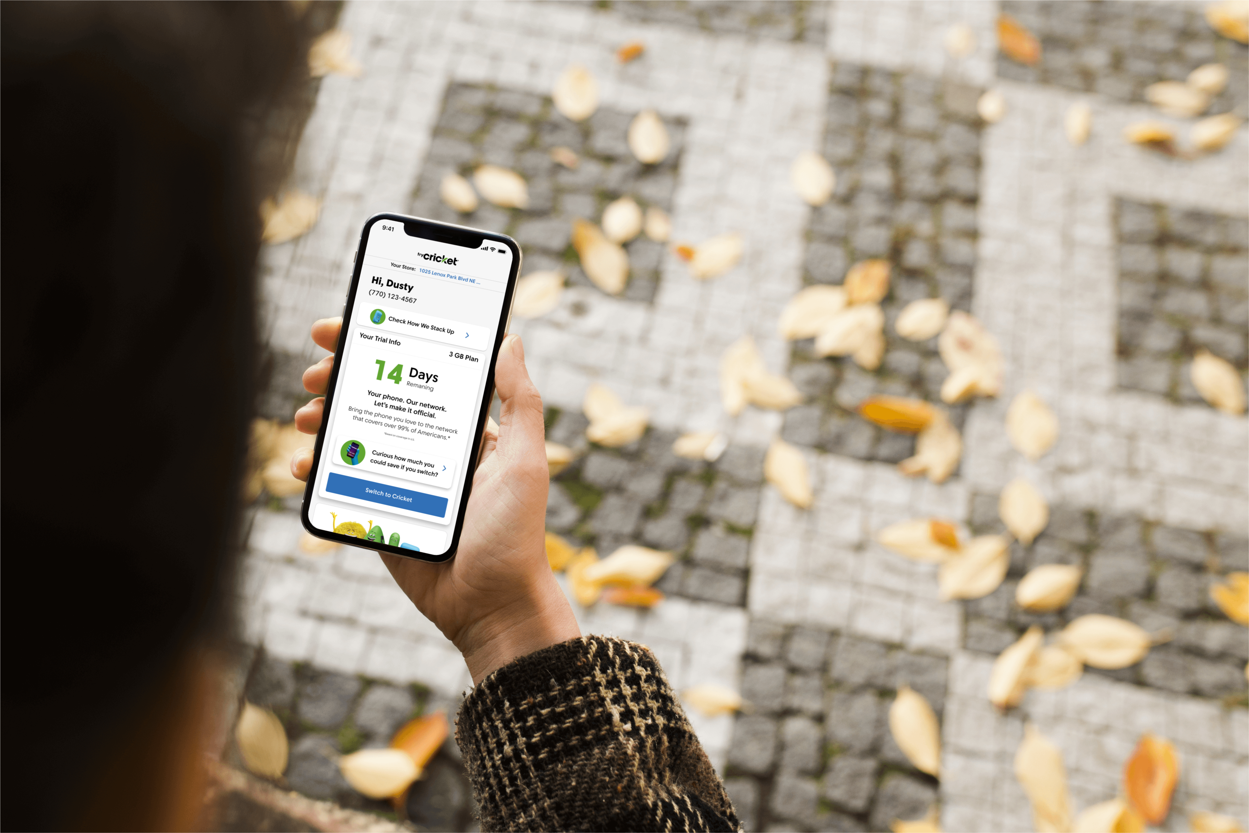
The app uses ample white space to create a clutter-free interface, ensuring that users can focus on critical elements without distractions. For example, the “14 Days Remaining” section is prominently displayed with bold typography and space around it, making it visually distinct and easy to locate.
Modular card-like components are used throughout the app, such as the FAQ section, payment methods, and plan comparison screens. These cards compartmentalize information, making it digestible and scannable.
Minimalist Aesthetic:
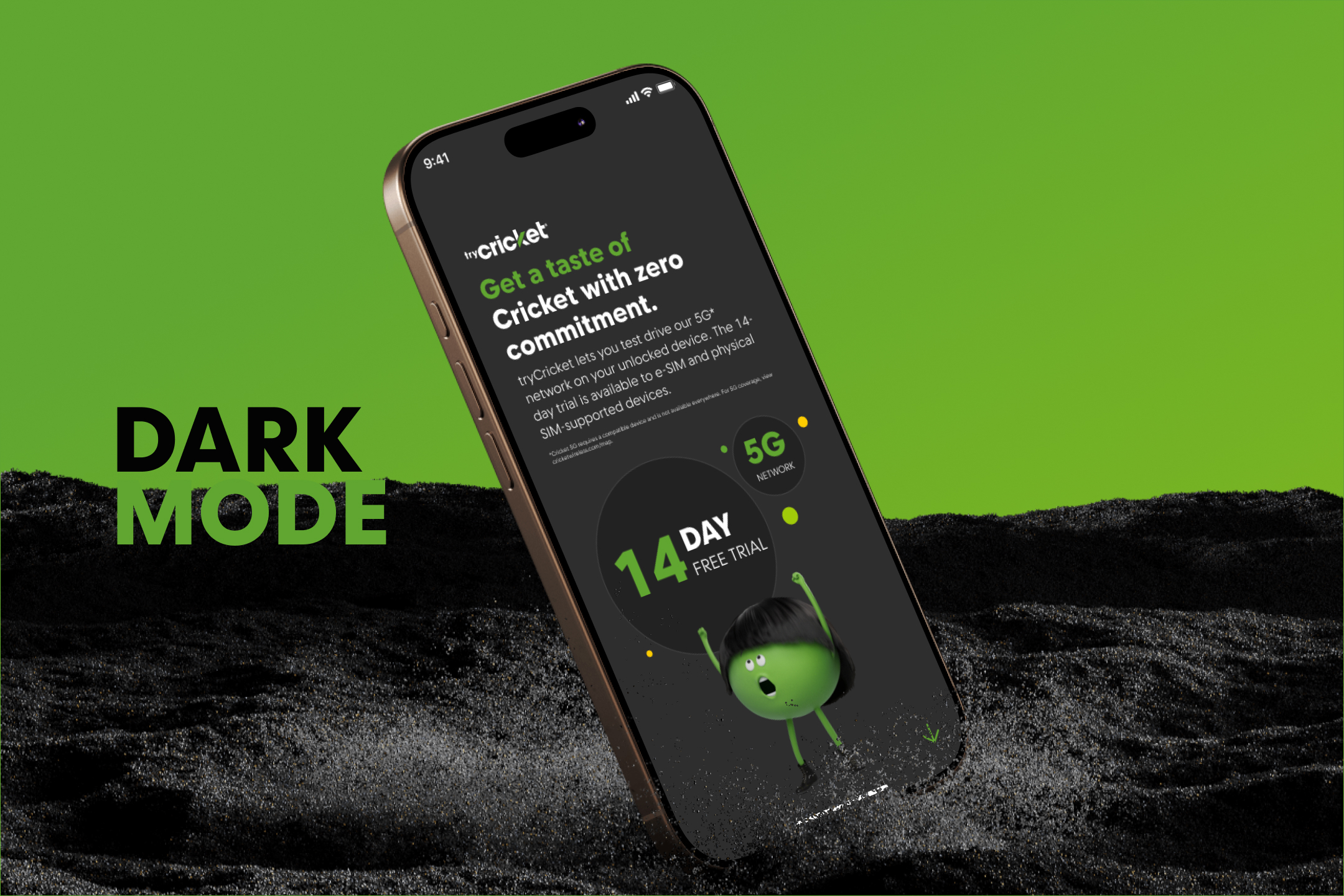
The design employs a minimalist approach with limited colors, primarily white backgrounds, and Cricket’s signature green accents, creating a cohesive and clean look reducing decision fatigue.
Guided Decision Making
The app includes a comparison tool for users to evaluate their current bill against Cricket’s offerings. This tool uses sliders and dropdowns for input, making it interactive and easy to use. By showing potential savings (e.g., “$25/month or $300/year”), users are incentivized to proceed with the switch.